A Deep Dive Into CSS Box model — 1
5 Problems Developers Encounter While Working With The Box Model And How To Solve Them

I am a software developer with a passion for frontend technologies using vanilla HTML, CSS, JavaScript, and frameworks like Bootstrap and React. I also write Backend for websites sometimes using Python and Django.
The CSS box model and document flow are two basic concepts upon which advanced, fundamental layout techniques are built. While document flow describes the way HTML elements are rendered on the browser, the box model determines HTML elements’ dimensions respective to their content and other elements. As a web developer, a good understanding of the box model is required to design well-structured website layouts. In this article, you’ll take a deep dive into the CSS box model by learning some of the problems you may encounter while working with the box model and how you can solve them.
The Difference Between Content, Padding, Border, And Margin
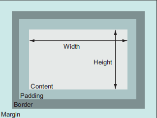
The Box model is essentially a browser-defined box that wraps around HTML elements. It consists of—from the exterior—margin, border, padding, and content. In a simple context, the content box may contain a text or a child HTML element; the padding is the space around the content; the border, as its name implies, is the barrier between the interior and the exterior; and the margin is the space beyond the border. For visual clarity, see the image below.
How Padding, Margin and Border Control HTML Element Spacing
Aside from the content, every constituent of the box model is a CSS property and it has default or developer values that define its styles. By default, the height and width you set for an element only affect the content, leaving out other components of the box model. As a result, an element without defined height and width takes up a space in its container element that is equal to its natural dimensions, overflowing the container if need be.
The size of a container element is the cumulative size of the box model constituents. The box model behaviour is prescribed by the CSS box-sizing property, which is naturally set to the value of content-box. Therefore, for an element with a specified height and width, the default content-box value of the box-sizing property is the content's dimensions, added to the sizes of the padding, border, and margin. For instance, if you define the style of a div element with a class of .container as in the code block below, the total size of the div will be (16px + 2px + 16px + 100px + 16px + 2px + 16px) 168px for its height and width respectively.
.container {
  height: 100px;
  width: 100px;
  padding: 16px;
  border: 2px solid black;
  margin: 16px;
  }
In a situation where you have two sibling div containers that you wish to arraign side by side, but with different widths; you have .container-a take up 60% of the parent element’s width and .container-b have the remaining 40% while still giving each container a padding of 1em, a margin of 0.5em, and a border of 1px, you’ll discover that the two div containers will be stacked on each other—the second div, .container-b will be wrapped around .container-a.
<!--CSS-->
<style>
.wrapper {
  width: 250px;
}
.container {
  padding: 16px;
  margin: 8px;
  border: 1px solid red;
}
.container-a {
  width: 60%;
}
.container-b {
  width: 40%;
}
</style>

<!--HTML-->
<div class="wrapper">
  <div class="container container-a"></div>
  <div class="container container-b"></div>
</div>
You may think that the 60% of .container-a sums up with the 40% of .container-b to give a 100% width that fills the .wrapper container, however, .container-a consumes a total of 200px or 80% of the .wrapper container. To resolve this issue, the box-sizing property is set to border-box.
This refines the defined height and width of an element to be a cumulative of the padding, border, and content sizes, instead of the content alone. The box-sizing property can be specified in the root selector, and inherited in the universal, pseudo-before and -after selector instead of including it in the size of every element. In this way, it is applied to all the elements in an HTML document.
:root {
  box-sizing: border-box;
}

*,
::before,
::after {
  box-sizing: inherit;
}
Understanding The Differences Between Inline And Block Elements And How They Affect Page Layout
The CSS display property and its application to HTML elements are important when determining the layout of a website. Therefore, understanding the distinction between inline and block—the two default display values, one of which is inherent to every HTML tag—is a guide to controlling the layout of a webpage. Block-level elements start on a new line by default and consume the full width of its horizontal block space, irrespective of its content length. Also, the browser automatically gives a block-level element a top and bottom margin, spacing it out from elements above and below. There are about 29 block-level elements, however, the heading, div, p, list, and form tags are common examples among others.
Inline elements on the other hand are a perfect contrast to block-level elements. They take up space enough for their content, do not start on a new line, and most definitely, do not get an automatic margin from browsers. The most common example of inline elements is the span tag. Like the div tag, span elements are used to apply unique styles to some of the content of an inline element that requires it. However, the span tag’s manner of application differs from div in that their display values are different. Also, while a div element can take any CSS style due to its display value, span tags as well as other inline elements do not conform to the CSS width and height properties. Other inline elements include anchor, image tags and many others.
How do these display values affect a website’s layout?
Developers often embed elements within elements, which is totally fine, but embedding an element with the wrong display value in another element can disrupt the layout of a webpage. Naturally, block-level can have either a block or inline element as a child element, but an inline element is only spared the freedom of having inline elements like itself as child elements. Therefore, having a span hold a div element renders the latter useless, causing you a bug in your code and disrupting your website’s layout. There’s a general fix to this problem, which is setting the span tag to a block-level element with CSS to accommodate the div, notwithstanding, this fix meddles with your code optimization quality as a developer.
An important point I haven’t discussed so far in this section is its correlation with the box model. If you remember, block-level elements are automatically given top and bottom margins by the browser. What happens then if you stack a block-level element on another? You get a summed margin space between the two elements, right? That’s wrong! There’s a concept known as collapsed margin which negates this assumption of summed-up margins and you’ll explore it in the next section.
Collapsed Margin
Collapsed margin has been a nightmare for many web developers, especially newbies. There are situations where you have vertically adjacent elements, one with a top margin and the other, with a bottom margin, but when you inspect the result on your browser, only one margin is apparent. This phenomenon is known as margin collapsing or collapsed margin and is more common with block-level elements due to their automatic top and bottom margins. For instance, paragraph tags have a default automatic margin of 1em; when stacked upon another, the resultant middle margin remains as 1em instead of 2em. Collapsed margin occurs irrespective of the margin units (px, em, rem, etc) and the operator before the margin (-20px or 10px). When two elements with a defined margin are stacked, one on the other, the element with the lesser margin gets collapsed into the other, and the greater margin dominates the space. Take a look at the code block below for clarity.
.element1 {
  margin-top: 20px;
}

.element2 {
  margin-bottom: 36px;
}

/* The size of the collapsed margin is 36px */
The space between the two elements is 36px, not the total sum of both margins, 56px.
In situations where both elements have negative margins, the size of the collapsed margin is the most negative or smallest margin.
.element1 {
  margin-top: -2.5em;
}

.element2 {
  margin-bottom: -0.5em;
}

/* The size of the collapsed margin is -2.5em */
If the margins involved are negative and positive, then the collapsed margin goes to none, instead, it becomes equivalent to the sum of both margins.
.element1 {
  margin-top: -2.5em;
}

.element2 {
  margin-bottom: 3.5em;
}

/* The size of the collapsed margin is (-2.5em + 3.5em) 1em */
In situations where the top and bottom margins of each respective element have the same size but different operators, e.g., -3.5em margin-top and 3.5em margin-bottom, the collapsed margin is zero.
While collapsed margin occurs in vertically adjacent elements, it is crucial to note that it does not apply to horizontally adjacent elements and elements with a display value of flex.
Centring Elements On A Webpage
Centring elements is another problem developers struggle with that relates to the box model. The CSS text-align property does help in centring an element horizontally irrespective of its display value. However, for some unknown reasons, vertical-align which is meant to complement text-align and centre an element vertically does not work with all elements, and it remains a headache for web developers to date. There are many known approaches to centring an element but the one that involves the box model is the margin and padding method. The padding method works when there’s a single content in a block-level element and it only centres the content vertically by applying equal padding to the top and bottom of the element. If the box-sizing property is set to border-box, equal padding applies spaces to the top and bottom of the content and the spaces are not affected by margins, applied or not.
.padded {
  padding: 50px 0;
}
On the other hand, if you leave box-sizing unaltered and the element has defined margins, the latter influences the spaces around the element, and you may not get the desired effect. Another method of centring elements is by setting the margin to auto and specifying a width for the element. Using this method centres your element horizontally; the element takes up the space of the specified width’s dimensions and the margin property sets an equal margin to each side of the element from the remaining space.
.margined {
  margin: auto;
  width: 40%;
}

/* margined element takes up a width of 40% of its container, and each side has a margin of 30%, each from the leftover space of 60% */
Unto vertical-align. The reasons behind the unresponsive behaviour of the CSS vertical-align property are not unknown. In the real sense, they are not correctly understood. vertical-align centres an element vertically as its name implies, but not all elements. It only works for elements inline and table-cell elements. For this reason, people who understand this CSS property use it to align img tags with neighbouring texts, either to the middle, top, or bottom, or leave it at its default value, baseline.
Conclusion
In this first part of A Deep Dive Into CSS Box Model article, you’ve learnt what the box model is, how it works, buggy situations that may arise while working with it, and how to resolve them. In this article, I mentioned five issues developers accost while working with the box model in no specific order. In the second part, you’ll take a deeper dive into more worrisome problems and explore different options available for solving them. Stay tuned and follow me or reach out to me via my Twitter handle @Tech Evangelist or my email gabrielshoyombo2002@gmail.com.
References
CSS IN DEPTH by Keith J. Grant
W3Schools — Inline vs Block elements
MDN — Mastering margin collapsing


